Starbiz Computers
Starbiz is a business services company offering IT infrastructure, networking, security systems, and web solutions.
Category
Branding and Framer website
Product Duration
1 -2 week
Introduction
Starbiz is a business services company offering IT infrastructure, networking, security systems, and web solutions.
The project involved designing a complete brand presence, including:
A conversion-focused landing page
Logo design
Letterhead
Company profile
My role was to shape how Starbiz presents itself digitally and offline, ensuring clarity, credibility, and consistency across touchpoints.


The Problem
Starbiz did not have a structured digital presence to represent its services professionally.
From a user’s perspective:
It wasn’t immediately clear what the company offered
There was no single place to understand services or contact the business
The brand lacked visual consistency across documents and communication
From a user’s perspective:
The company needed to look trustworthy to first-time visitors
Services had to be explained quickly and clearly
The website needed to support inquiries and lead generation
The core challenge was not just visual design, but building trust within seconds.


The Goal
The primary goal was to design a landing page that:
Communicates Starbiz’s services at a glance
Establishes credibility immediately
Guides users naturally toward contacting the business
At the same time, the brand identity had to remain consistent across:
Website
Letterhead
Company profile
Logo usage
Understanding the Users
The target users were:
Small business owners
Companies looking for IT and security solutions
Clients who value reliability and professionalism
Key characteristics:
Time-constrained
Decision-driven by trust
Prefer clear, no-nonsense information
This meant the design had to be simple, direct, and confidence-building.

UX Strategy
The experience was structured around three UX principles:
Clarity over persuasion
Instead of selling sustainability, the design explains it.Progressive disclosure
Complex ideas like circular systems are broken into simple, linear steps.Trust through consistency
Consistent spacing, typography, and layout patterns reinforce reliability.
UX Strategy & Information Architecture
To reduce cognitive load and improve clarity, the landing page follows a linear, scannable structure:
Hero Section
Clearly states what Starbiz does and establishes credibility immediately.Services Overview
Breaks down offerings into understandable blocks so users can quickly identify relevance.Why Starbiz
Focuses on trust, reliability, and professional execution rather than marketing jargon.Process & Work Approach
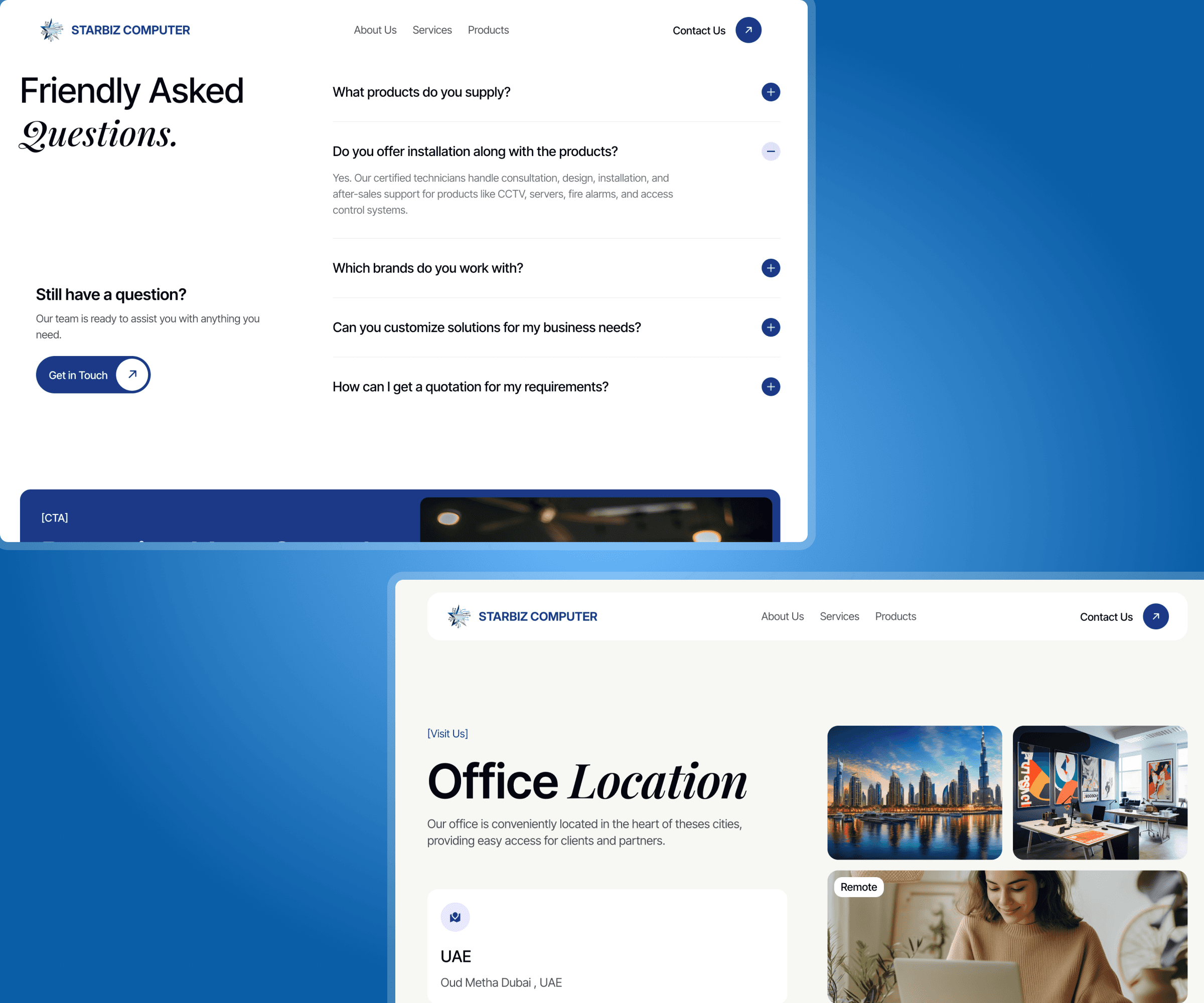
Helps users understand how the company operates, reducing uncertainty.FAQs
Addresses common concerns and questions users might have before reaching out.Contact Section
Makes the next step obvious and frictionless
Each section is designed to answer one key user question before moving to the next.


Visual Design Decisions
Brand Tone
The visual language was designed to feel:
Professional
Reliable
Modern but not trendy
This was important to appeal to business users who associate clean design with competence.
Color & Typography
Neutral, stable colors were used to convey trust
Clean typography ensured readability across devices
Clear hierarchy guides attention through the page
Layout
Strong use of spacing to avoid clutter
Section separation to improve scannability
CTAs placed after users have enough context to act
Brand Identity & Collateral Design
Beyond the website, I designed supporting brand assets to ensure consistency:
Logo
Simple and scalable
Works across digital and print
Designed to reflect professionalism rather than decoration
Color & Typography
Clean layout for official communication
Reinforces brand credibility in document
Company Profile
Structured content flow
Visually aligned with the landing page
Helps Starbiz present itself confidently in client discussions
This ensured that Starbiz speaks the same visual language everywhere


Outcome
The final result was:
A clear, trust-focused landing page built in Framer
A cohesive brand identity across digital and offline materials
A professional first impression for new users and clients
The project demonstrates how UX is not limited to interfaces, but extends to how a brand communicates, builds trust, and guides decisions.